

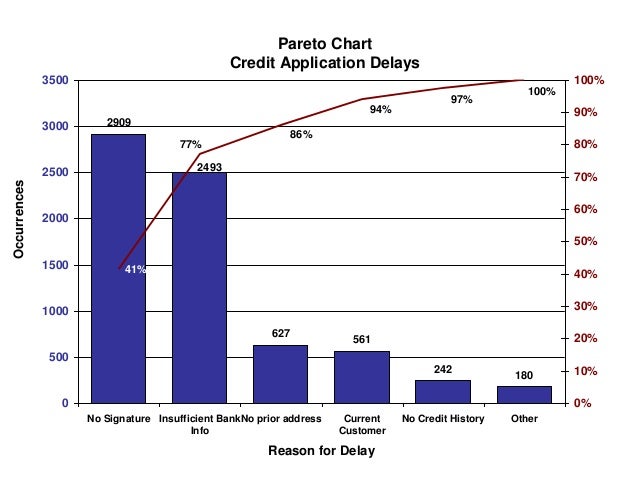
A Pareto diagram is a simple bar chart that ranks related measures in decreasing order of occurrence. The principle was developed by Vilfredo Pareto, an Italian economist and sociologist who conducted a study in Europe in the early 1900s on wealth and poverty.
The 80-20 rule maintains that 80% of outcomes (outputs) come from 20% of causes (inputs). In the 80-20 rule, you prioritize the 20% of factors that will produce the best results. A principle of the 80-20 rule is to identify an entity's best assets and use them efficiently to create maximum value.
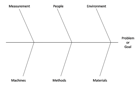
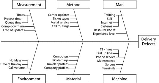
A cause-effect diagram is a visual tool used to logically organize possible causes for a specific problem or effect by graphically displaying them in increasing detail, suggesting causal relationships among theories. A popular type is also referred to as a fishbone or Ishikawa diagram. It was developed in the 1960s and explores all possible causes of a problem. One of the most basic yet powerful brainstorming tools for capturing all the potential factors in your system is a fishbone diagram, named because of its bony, fish-like shape. Sometimes a fishbone diagram is called an Ishikawa diagram, after Kaoru Ishikawa, who first suggested its use.

A quality control checklist is basically a written guide for your products' contents, packaging, color, barcodes, appearance, possible defects, functions and special requirements. It's also sometimes called an “inspection criteria sheet” or inspection checklist.

Histogram: a graphical display of data using bars of different heights. It is similar to a Bar Chart, but a histogram groups numbers into ranges . The height of each bar shows how many fall into each range.
LEAN / SIX SIGMA MEASURES
Part of the Six Sigma method
is to calculate the number of defects that the process delivers. There
are various metrics used to evaluate defects: Defects per Unit (DPU), Defects per Opportunity (DPO) and Defects-per-Million-Opportunities (DPMO).
The average number of defects per unit. The ratio of defects to unit is the universal measure of quality.
Given:
D: number of Defects
U: number of Units
Formul

Defects-Per- Million-Opportunities, which is abbreviated as DPMO. It is also called as NPMO or Nonconformities per Million Opportunities. It is defined as the ratio of the number of defects in a sample to the total number of defect opportunities multiplied by 1 million. DPMO is a long-term measure of process performance. It is a measure of the error rate of a process. The metric tells you how good your process is towards committing mistakes. It requires you to think reversely. Why is it necessary to calculate the DPMO of a process? It gives your business an accurate picture of the efficiency of your process. Depending on the Defects-per-Million-Opportunities, your company can decide whether it is necessary to launch a Six Sigma project that will improve the process and reduce the number of opportunities for defects per million products. If the DPMO is too high, you run the risk of negatively affecting customer satisfaction which in turn will reflect negatively on your business. Six Sigma business improvement projects focus on reducing errors and increasing customer satisfaction and thereby nurturing a healthy business.
Defects per Million Opportunities (DPMO) – a ratio of the number of defects (flaws) in 1 million opportunities when an item can contain more than one defect. To calculate DPMO, you need to know the total number of defect opportunities.


Parts per Million Defective (PPM) – the number of defective units in one million units. (PPM is typically used when the number of defective products produced is small so that a more accurate measure of the defective rate can be obtained than with the percent defective.)

For example, a sample of 50 cell phones finds that 3 of them are defective. The PPM defective is then:

Rolled Throughput Yield (RTY) (also known as the First Pass Yield) – the probability (or percentage of time) that a manufacturing or service process will complete all required steps without any failures. Reliability principles are the basis for calculating the rolled throughput yield. The reliability formula for a system in series with n process steps is:
Rs = (R1) (R2) (R3) (R4) … (Rn)
Since the reliability of a process step is the yield of that process step when quality is the performance metric, this formula then becomes:
RTY= (Y1) (Y2) (Y3) (Y4) … (Yn) where Y is the yield (proportion good) for each step
For example, a four-step process has a yield of 0.98 in step 1, 0.95 in step 2, 0.90 in step 3, and 0.80 in step 4.
RTY = (0.98)(0.95)(0.90)(0.80) = 0.67032
This means that only 67.032% of the units completed on this process will make it through all four steps without needing any rework or repair.

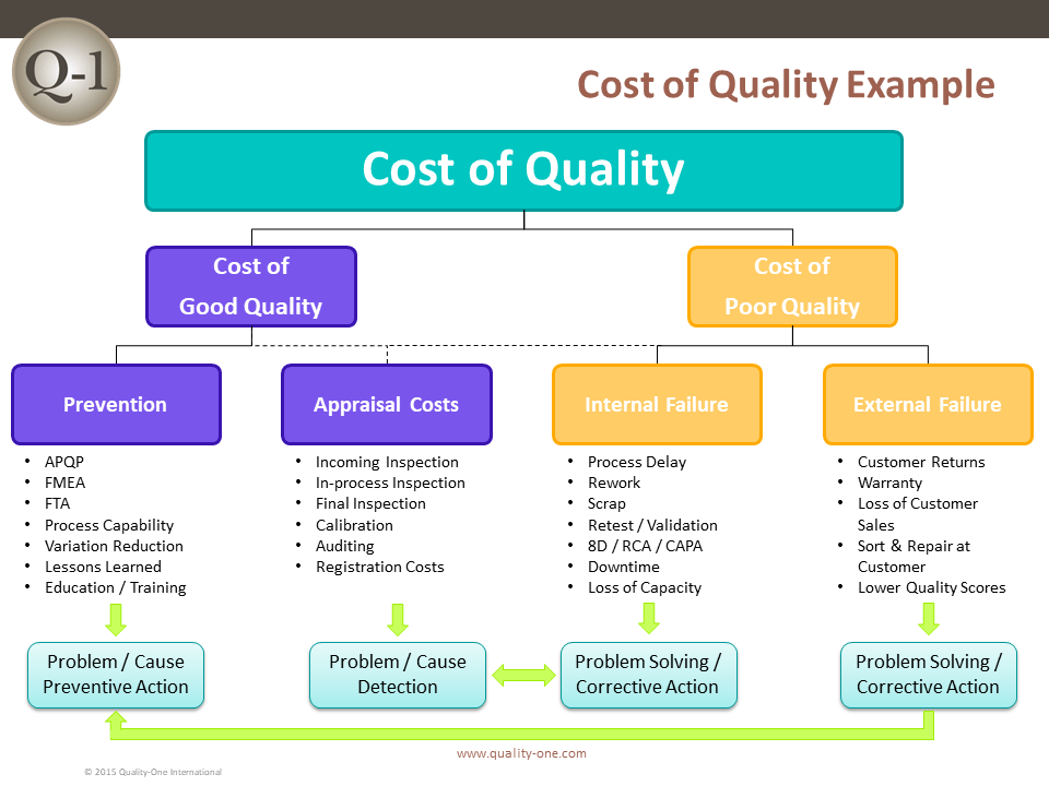
COPQ as used in companies ~ Cost Of Poor Quality
Companies prefer categorizing COPQ in four different categories and until date, this is the best way how COPQ could be broken down
- Internal Failure Cost
- External Failure Cost
- Prevention Cost
- Appraisal Cost
Internal Failure Cost
These costs are due to deficiencies discovered before delivery of the product, with the product not being able to meet stated and perceived needs of the customer. These costs also include process inefficiencies and process losses (See rework) even if the customer needs are met.
- Failure to meet customer needs --- Examples are Downgrading, scrap and rework
- Inefficient processes --- Unplanned downtime, variability of product characteristics, Difference from benchmarked products
External Failure Cost
These costs are associated with deficiencies found after product is delivered to the customer. This cost will also factor in costs due to missed sales. How? For example, you shipped 100 pens to the customer and the customer reports 10 pens defective. Chances are --- He wouldn’t pay for these 10 pens. Assume price per pen is $5. Means $50 lost due missed sales and this is nothing but an external failure cost for the company!
- Failure to meet customer needs --- Warranty
- Cost due lost sales --- Customer Defectives
Appraisal Cost
These are costs associated/incurred to meet the degree of conformance or determine the degree of conformance to customer requirements. You normally associate appraisal costs with inspections, audits, and evaluation of stocks.
In collecting appraisal costs, what is decisive is the kind of work done and not the department name (the work may be done by chemists in the laboratory, by sorters in Operations, by testers in Inspection, or by an external firm engaged for the purpose of testing). Also note that industries use a variety of terms for “appraisal,” e.g., checking, balancing, reconciliation, review.
Prevention Cost
Prevention costs are incurred to keep the Appraisal and Failure Costs to a bare minimum. Goes to show that appraisal and failure costs are often treated as direct indicators of how inefficient the process could be, in terms of passing defects on! Obviously no business would like to pass defects to the customer and that’s why Prevention costs kick in.
The compilation of prevention costs is initially important because it highlights the small investment made in prevention activities and suggests the potential for an increase in prevention costs with the aim of reducing failure costs.
Experience also suggests, however, that continuing measurement of prevention costs can usually be excluded in order to (1) focus on the major opportunity, i.e., failure costs, and (2) avoid the time spent discussing what should be counted as prevention costs.
This part of the section focuses on the question “How much is it costing our organization by not doing a good job on quality?” Thus we will use the term “cost of poor quality.” Most (but not all) of the total of the four categories is the cost of poor quality (clearly, prevention costs are not a cost of poor quality.) Strictly defined, the cost of poor quality is the sum of internal and external failure costs categories. But this assumes that those elements of appraisal costs—e.g., 100 percent sorting inspection or review—necessitated by inadequate processes are classified under internal failures. This emphasis on the cost of poor quality is related to a later focus in the section, i.e., quality improvement, rather than just quality cost measurement.
No comments:
Post a Comment